COMMU
COMMU is a community app designed to address the challenges faced by newcomers in navigating new places. Within this app, users can discover communities filled with individuals who share their interests. Users also have the ability to explore various restaurants and activities, as well as schedule appointments using the app.

Project Overview
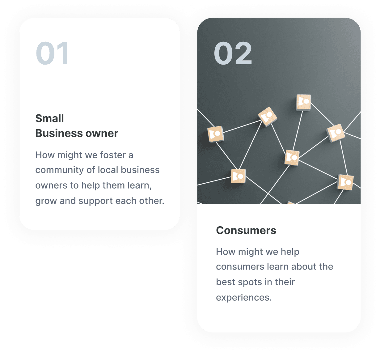
Background
Design process
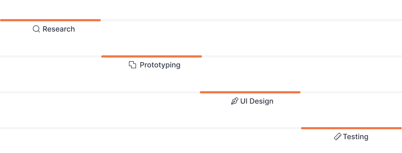
The design process is a journey of exploration, creativity, and problem-solving that ultimately leads to the creation of something truly exceptional.
Figma
Adobe Illustrator
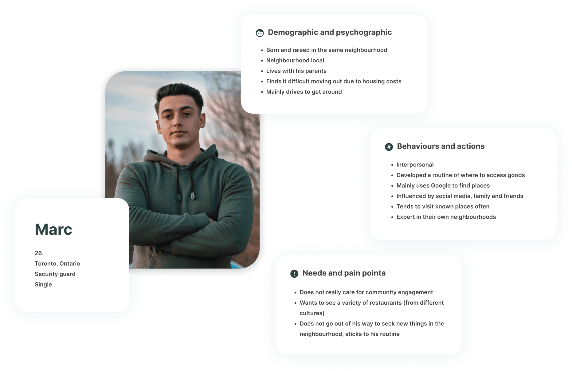
User Research
User interview & coding


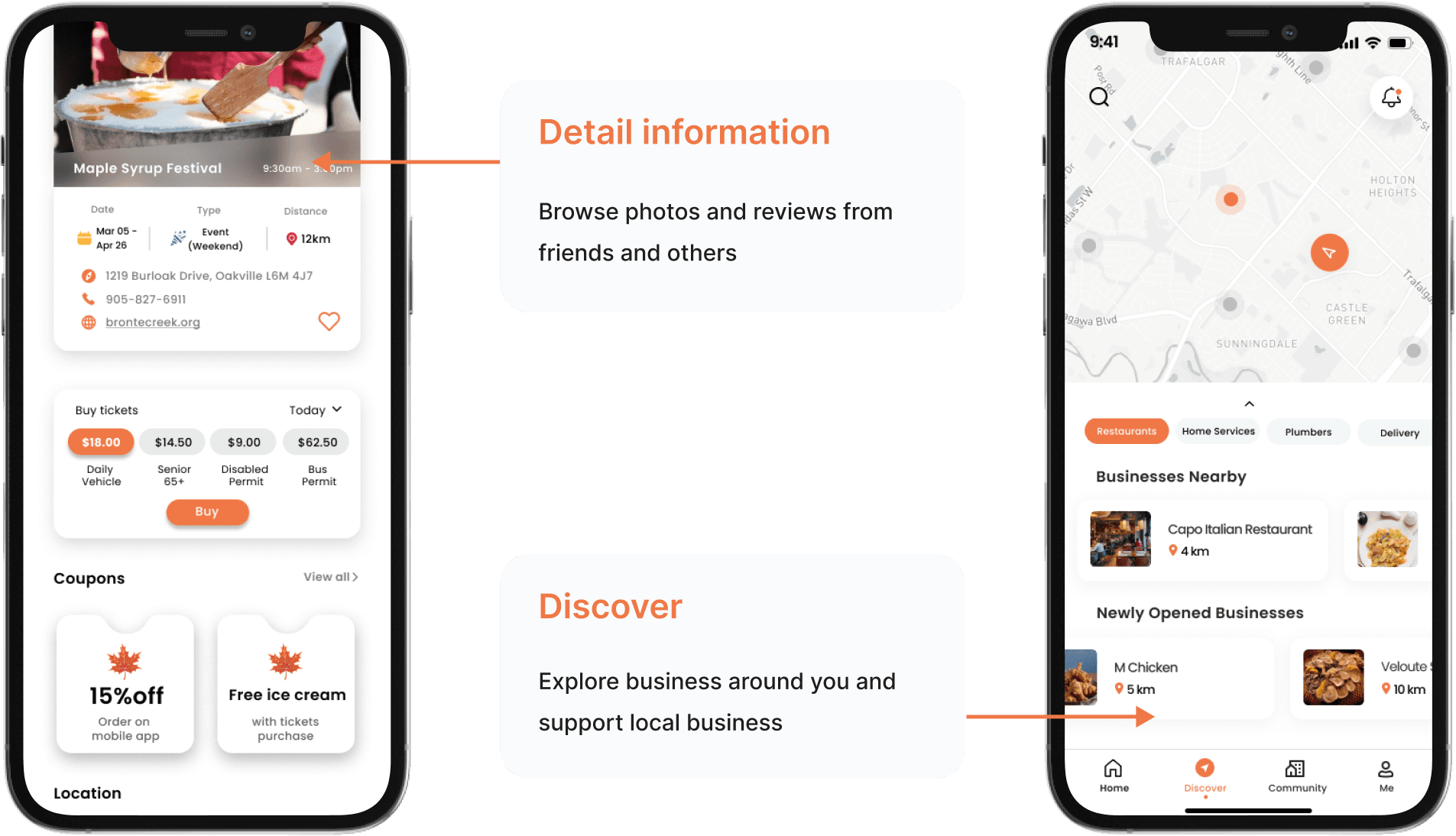
Solution design


• Events, discovery page
• Business and event information page
• Fixed navigation bar

• Coupons being visible/accessible in the business/event information page
• More in-depth information of menus
• “Reviews” instead of discussions

• Further development of community and profile screens

• Showing nearby businesses on the map
• Activating “check route” button
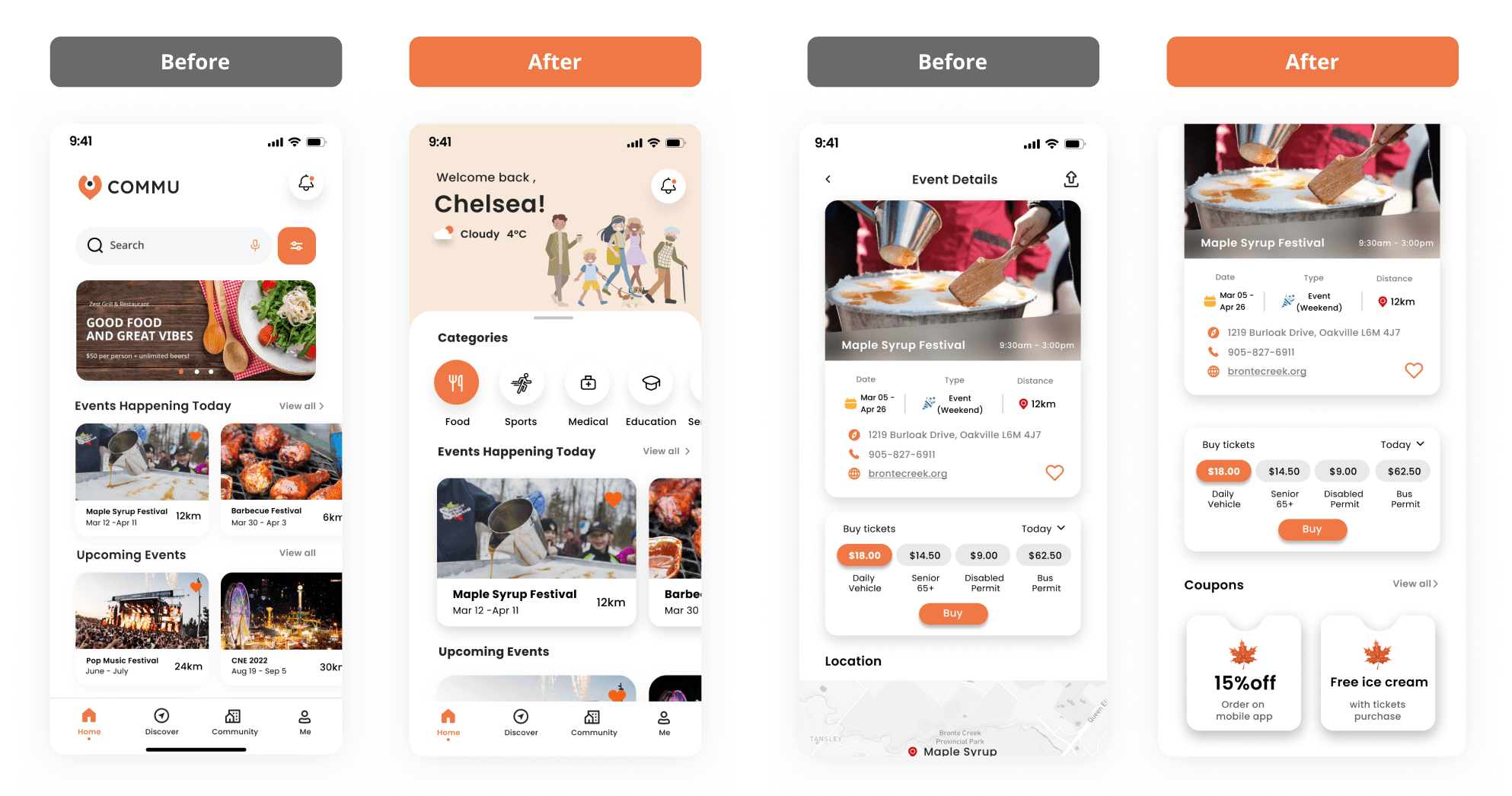
In our previous presentation, we received feedbacks from our professor and the industry partner that our home page lacks the feeling of “home”, so we tried to make the interface a lot more suitable for its purpose by personalizing the experience and utilizing pastel tone for colour and an illustration to invite the user.
One of the most common feedback we received from our professors and the user testing participants is that they would like to see the coupons visible on the details/information page than in the
“my accounts” page.
Round 2
In this testing phase, we were most interested in whether our prototype targets the HMW statement of prompting importance in community engagement within users. Therefore, we switched up the tasks accordingly to allude that narrative.
What we found
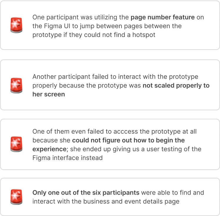
Round 3
In this testing phase, we made sure that the participants were interacting with the business and events detail page, and modified our script to lead the user towards that narrative. In result, we were able to gather insightful feedbacks from our participants.
Overall feedback
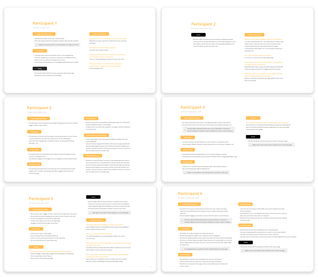
Our eight participants in the final two rounds of testing have shown us a lot of potential that our product, Commu, can still reach, despite the number of times and hours we have spent editing the prototype. We as a group feel that this was a valuable experience in knowing how much feedback a product can receive, just by a short prototype!
• Easy to use and intuitive, participants have noted that they would use this app
• Excellent in the sense that it has a lot of useful features (ex. popular times, book tables... etc.)
• Exciting as it displays detailed information of events and businesses
• Inviting and engaging to participants through the use of colour
• A good hub of information for people to engage with small businesses and events in
their communities
• Working on extra screens in between registration and login page to direct a logical flow
• Fixing the navigation bar at the bottom of business/event details page
• Fixing the back button somewhere on the business/event details page
• Figuring out the points system; remove it, or mention it on other parts of the product
• A set of onboarding screens would be useful to lay out the features of the product
• Activating other features in the design (ex. “check route”)
Solution