HongMall
HongMall Redesign
App User Experience & Interface Redesign
App User Experience& Interface Redesign
Online shopping
Online shopping
Online shopping
After 6 years of the first version we design for our app, for enhancing the B2C platform's experience for shopping customers, we decide to redesign our platform and develop the 2.0 version. It was launched on February 2023.
After 6 years of the first version we design for our app, for enhancing the B2C platform's experience for shopping customers, we decide to redesign our platform and develop the 2.0 version. It was launched on February 2023.
After 6 years of the first version we design for our app, for enhancing the B2C platform's experience for shopping customers, we decide to redesign our platform and develop the 2.0 version. It was launched on February 2023.

Aug 2022 - Feb2023
Timeline
UIUX Designer/Researcher
Role
Aug 2022 - Feb2023
Timeline
UIUX Designer/Researcher
Role
Background
Background
This is the case study on the UI/UX redesign of HongMall app, an e-commerce platform. The redesign process involved user research, competitor analysis, and iterative design to enhance user experience. Key improvements included a more intuitive navigation system, streamlined checkout process, and personalized recommendations, all aimed at improving customer satisfaction and engagement with the platform.
This is the case study on the UI/UX redesign of HongMall app, an e-commerce platform. The redesign process involved user research, competitor analysis, and iterative design to enhance user experience. Key improvements included a more intuitive navigation system, streamlined checkout process, and personalized recommendations, all aimed at improving customer satisfaction and engagement with the platform.
Start
Problem Research
Problem Research
Problem Research
Problems
Problems
Problems
Problems
1
User Experience
• Product detail page is not informative • The "My" page is not obvious enough to find related functions, and the search efficiency is low. • Inconvenient to search "Logistics Information". • App personalized recommendation content recommendation is less
1
User Experience
• Product detail page is not informative • The "My" page is not obvious enough to find related functions, and the search efficiency is low. • Inconvenient to search "Logistics Information". • App personalized recommendation content recommendation is less
1
User Experience
• Product detail page is not informative • The "My" page is not obvious enough to find related functions, and the search efficiency is low. • Inconvenient to search "Logistics Information". • App personalized recommendation content recommendation is less
2
User Interface
• Text hierarchy is not obvious enough • The design doesn't breathe • Too many page styles and color palettes • Badage style is not unified enough, affecting the product image display • Insufficient contrast of card text • Complex form design, affecting the filling efficiency
2
User Interface
• Text hierarchy is not obvious enough • The design doesn't breathe • Too many page styles and color palettes • Badage style is not unified enough, affecting the product image display • Insufficient contrast of card text • Complex form design, affecting the filling efficiency
2
User Interface
• Text hierarchy is not obvious enough • The design doesn't breathe • Too many page styles and color palettes • Badage style is not unified enough, affecting the product image display • Insufficient contrast of card text • Complex form design, affecting the filling efficiency
Solutions
Solutions
Solutions
Solutions
1
User Interface Design
After analyzing the previous iteration, we have meticulously redefined our design approach. The aesthetic has been enhanced, incorporating the brand's intellectual property into the app's design, adding a more personal touch.
1
User Interface Design
After analyzing the previous iteration, we have meticulously redefined our design approach. The aesthetic has been enhanced, incorporating the brand's intellectual property into the app's design, adding a more personal touch.
1
User Interface Design
After analyzing the previous iteration, we have meticulously redefined our design approach. The aesthetic has been enhanced, incorporating the brand's intellectual property into the app's design, adding a more personal touch.
2
User Experience Design
This revamp also focuses on enhancing user efficiency, ensuring a more streamlined and effective shopping experience on the Hongmall App.
2
User Experience Design
This revamp also focuses on enhancing user efficiency, ensuring a more streamlined and effective shopping experience on the Hongmall App.
2
User Experience Design
This revamp also focuses on enhancing user efficiency, ensuring a more streamlined and effective shopping experience on the Hongmall App.
Tools
Tools
Tools
Figma
Adobe Illustrator
Asana
Final Design
Final Design
My Page
My Page
My Page
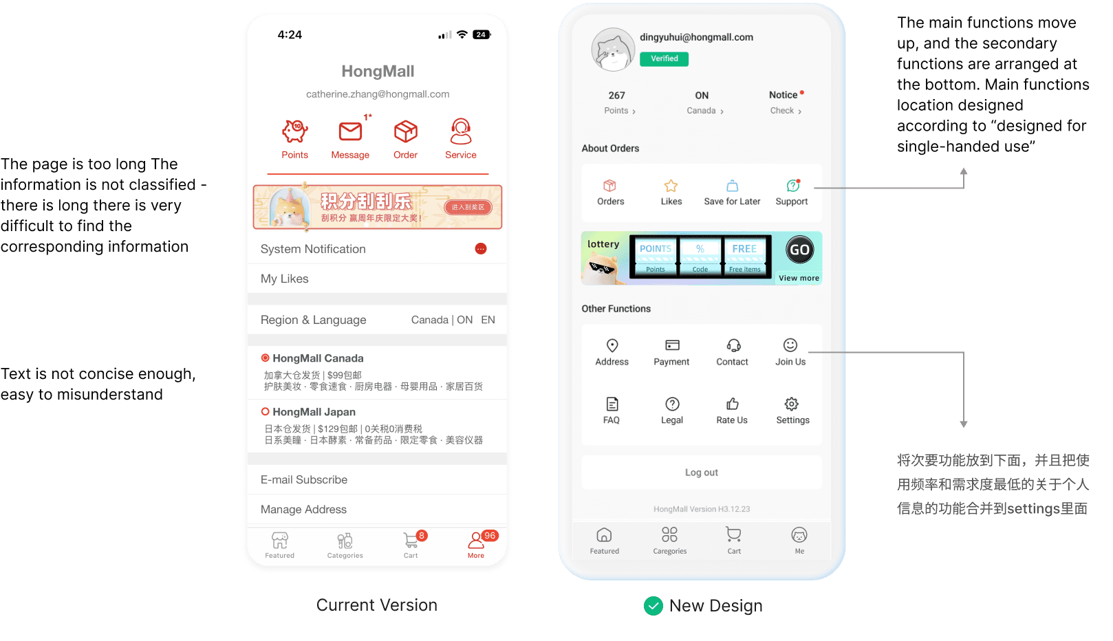
By segmenting the page and strategically organizing its features, we enhanced user efficiency in locating and utilizing functions. Critical information such as coupons, points, and locations are visually represented for quick access, minimizing the need for excessive user interactions.
By segmenting the page and strategically organizing its features, we enhanced user efficiency in locating and utilizing functions. Critical information such as coupons, points, and locations are visually represented for quick access, minimizing the need for excessive user interactions.
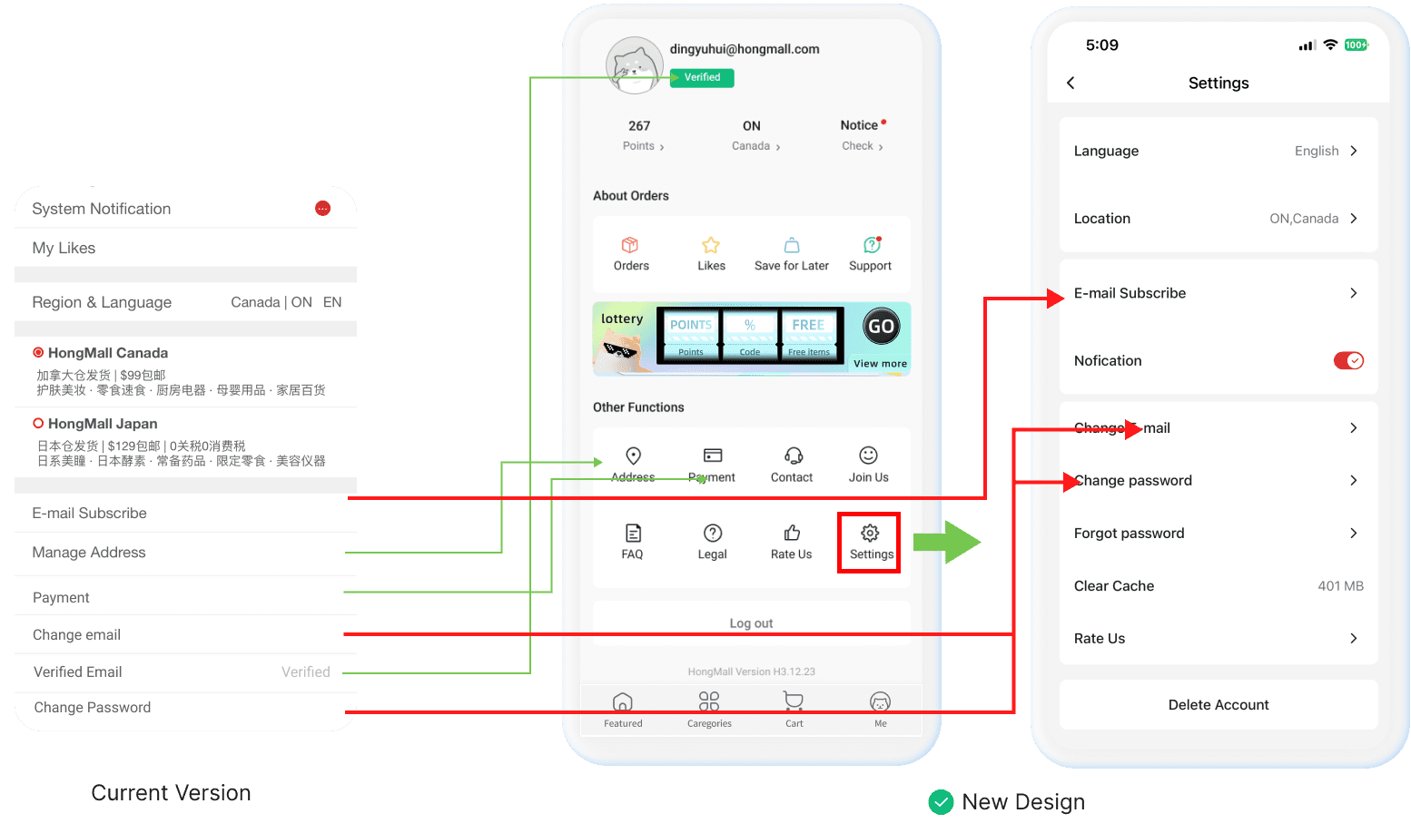
New Version - Settings Page Design
New Version -Settings Page Design
New Version - Settings Page Design
Condensing the page by merging functionalities of similar levels into a unified settings page
Condensing the page by merging functionalities of similar levels into a unified settings page
Final Adjustment
Final Adjustment
Final Adjustment
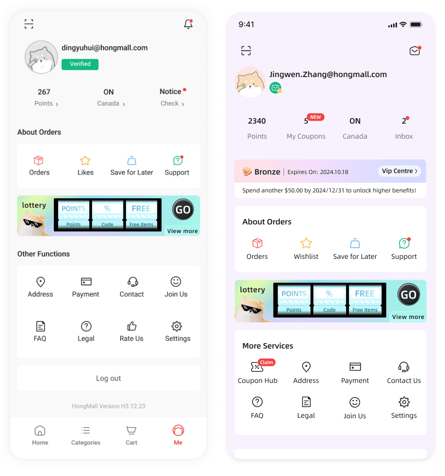
Due to the principle of accessibility, our first version of the design was too light for the user's eyes. To address this issue, we redesigned my page.
We have also adjusted some information that needs to be visualized for customers. Removed the small triangular sign, the whole section is more clean and tidy
Added VIP Centre, (VIP Centre is showing in the “Loyalty system design page of my portfolio”)
We added coupon hub part based on the design of loyalty system. Then we removed “Rate us” part, because it is not as important as other features here.
Final Design
Final Design
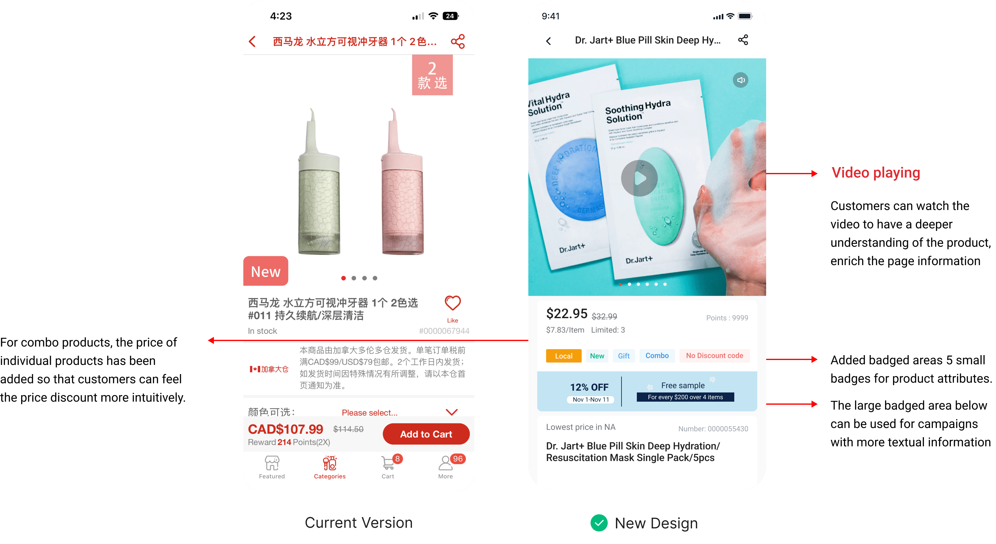
Product Detail Page
Product Detail Page
Product Detail Page
The product details page is a relatively big change

Final Design
Final Design
Final Design
Product Cards
Product Cards
Product Cards

Badge Details
Badge Details
Badge Details

Deal List
Deal List
Deal List

Final Design
Final Design
Final Design
Other Pages
Other Pages
Other Pages
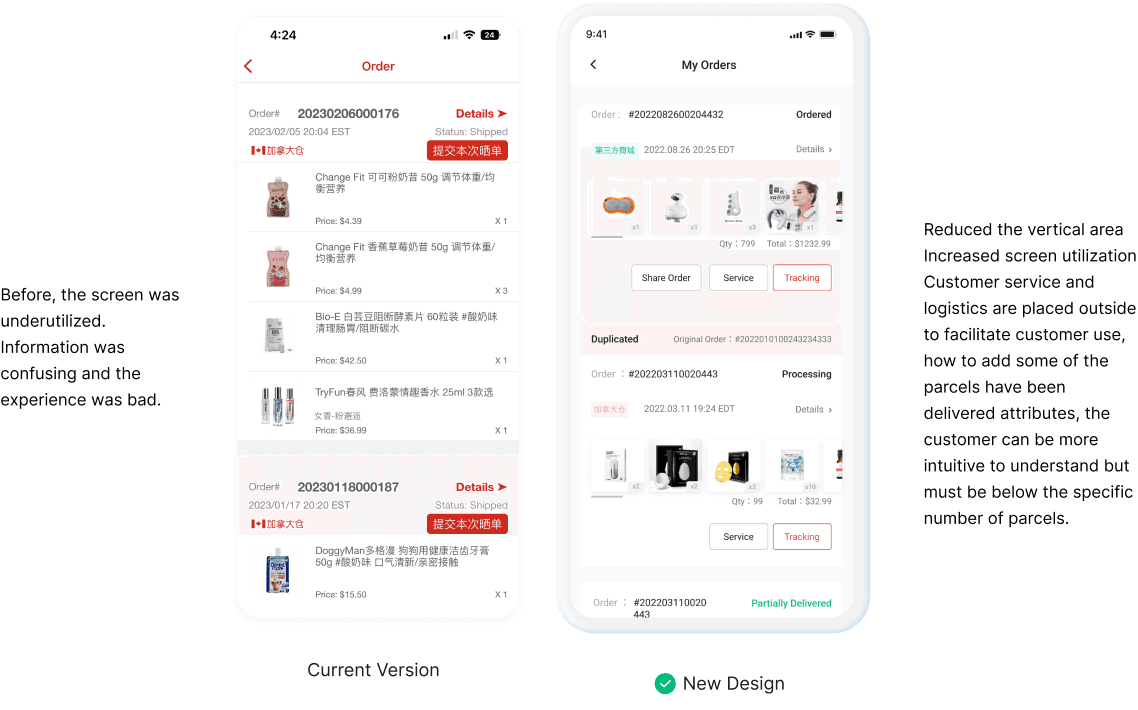
My Orders
My Orders
My Orders
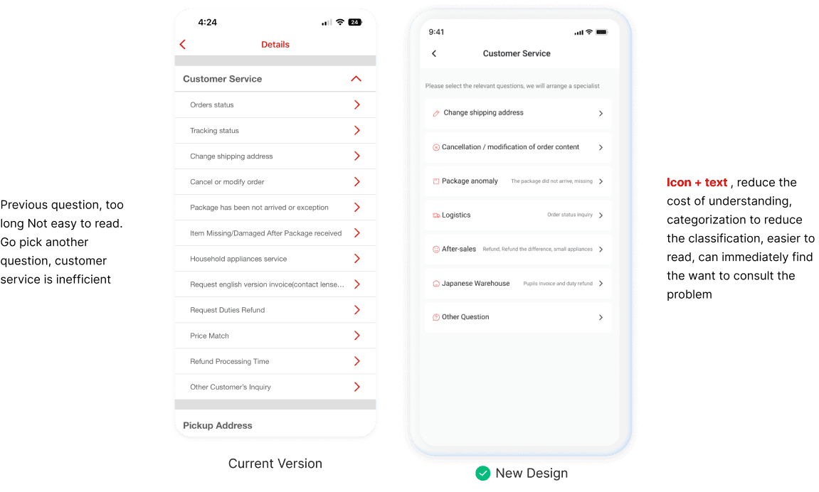
Customer Service
Customer Service
Customer Service
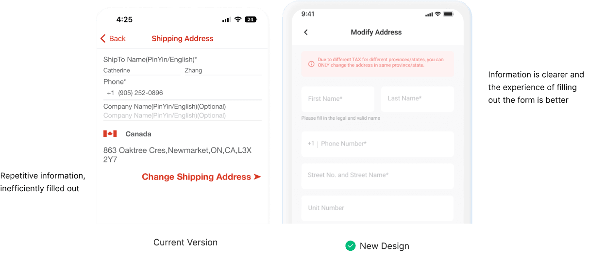
Form Design
Form Design
Form Design
Final Design
Final Design
Final Design
IP Using
IP Using
IP Using
On the blank pages, we incorporated illustrations related to our intellectual property. This addition enriches the otherwise empty space with engaging content, preventing users from feeling discomfort due to the lack of information.
On the blank pages, we incorporated illustrations related to our intellectual property. This addition enriches the otherwise empty space with engaging content, preventing users from feeling discomfort due to the lack of information.

Feedbacks
Feedbacks
A Successful Release
A Successful Release
A Successful Release
The UI redesign was launched in February 2023, and the feedback has been overwhelmingly positive. Users have praised its new features, highlighting how they enhance their workflow.
The UI redesign was launched in February 2023, and the feedback has been overwhelmingly positive. Users have praised its new features, highlighting how they enhance their workflow.
"The new badge is very useful for content management! We can set it up ourselves and don't need to wait for our design colleagues to design the badge for each campaign"
"The new badge is very useful for content management! We can set it up ourselves and don't need to wait for our design colleagues to design the badge for each campaign"
"The new badge is very useful for content management! We can set it up ourselves and don't need to wait for our design colleagues to design the badge for each campaign"
"The new badge is very useful for content management! We can set it up ourselves and don't need to wait for our design colleagues to design the badge for each campaign"
"The new badge is very useful for content management! We can set it up ourselves and don't need to wait for our design colleagues to design the badge for each campaign"
——— Operation Team Leader
——— Operation Team Leader
——— Operation Team Leader
"The whole platform is cleaner and more effective for customers to use. The layout of our new product detail page attracts more customers to use our app "
"The whole platform is cleaner and more effective for customers to use. The layout of our new product detail page attracts more customers to use our app "
"The whole platform is cleaner and more effective for customers to use. The layout of our new product detail page attracts more customers to use our app "
"The whole platform is cleaner and more effective for customers to use. The layout of our new product detail page attracts more customers to use our app "
"The whole platform is cleaner and more effective for customers to use. The layout of our new product detail page attracts more customers to use our app "
——— HongMall CEO
——— HongMall CEO
This improved app UI design is tailored to enhance the efficiency and productivity of the operations team, saving time and streamlining tasks both for operation and design teams. I'm eagerly anticipating the next phase of the app home page, confident that it will continue to evolve and better serve our team’s needs.
This improved app UI design is tailored to enhance the efficiency and productivity of the operations team, saving time and streamlining tasks both for operation and design teams. I'm eagerly anticipating the next phase of the app home page, confident that it will continue to evolve and better serve our team’s needs.
This improved app UI design is tailored to enhance the efficiency and productivity of the operations team, saving time and streamlining tasks both for operation and design teams. I'm eagerly anticipating the next phase of the app home page, confident that it will continue to evolve and better serve our team’s needs.
This improved app UI design is tailored to enhance the efficiency and productivity of the operations team, saving time and streamlining tasks both for operation and design teams. I'm eagerly anticipating the next phase of the app home page, confident that it will continue to evolve and better serve our team’s needs.
This improved app UI design is tailored to enhance the efficiency and productivity of the operations team, saving time and streamlining tasks both for operation and design teams. I'm eagerly anticipating the next phase of the app home page, confident that it will continue to evolve and better serve our team’s needs.
This improved app UI design is tailored to enhance the efficiency and productivity of the operations team, saving time and streamlining tasks both for operation and design teams. I'm eagerly anticipating the next phase of the app home page, confident that it will continue to evolve and better serve our team’s needs.
Feedbacks
Feedbacks
Takeaways
Takeaways
Takeaways
My collaboration with other designers and engineers focused on identifying typographic hierarchical themes for each page and addressing technical constraints. This strategic focus was instrumental in delivering the entire new app design on time for our 7th anniversary. Looking ahead to the next version, my goal is to gather more user feedback and use it to further refine our shopping experience, enhancing its functionality and user experience based on user needs.
My collaboration with other designers and engineers focused on identifying typographic hierarchical themes for each page and addressing technical constraints. This strategic focus was instrumental in delivering the entire new app design on time for our 7th anniversary. Looking ahead to the next version, my goal is to gather more user feedback and use it to further refine our shopping experience, enhancing its functionality and user experience based on user needs.