Specialty pages
for Helloklarity
Design for mental health & wellness
The Klarity platform connects you with the best private practitioners in the country to improve your mental health online.
Live Preview
Specialty pages
for Helloklarity
Design for mental health & wellness
The Klarity platform connects you with the best private practitioners in the country to improve your mental health online.
Live Preview
Specialty pages
for Helloklarity
Design for mental health & wellness
The Klarity platform connects you with the best private practitioners in the country to improve your mental health online.
Live Preview
Specialty pages
for Helloklarity
Design for mental health & wellness
The Klarity platform connects you with the best private practitioners in the country to improve your mental health online.
Live Preview
Specialty pages
for Helloklarity
Design for mental health & wellness
The Klarity platform connects you with the best private practitioners in the country to improve your mental health online.
Live Preview
Specialty pages
for Helloklarity
Design for mental health & wellness
The Klarity platform connects you with the best private practitioners in the country to improve your mental health online.
Live Preview
Dec 2023-Jan 2023
Timeline
UI Designer
Role
Dec 2023-Jan 2023
Timeline
UI Designer
Role
Project Overview
Project Overview
Project Overview
Project Overview
Project Overview
As a designer in Klarity, I designed the specialty pages for serving over 30,000 patients to find out their providers. Specialty pages are for categorizing the providers, so that patients can find their providers as soon as possible by checking the name of different sickness.
As a designer in Klarity, I designed the specialty pages for serving over 30,000 patients to find out their providers. Specialty pages are for categorizing the providers, so that patients can find their providers as soon as possible by checking the name of different sickness.
Tools
Tools
Tools
Figma
Elementor
Problem
How might we help patients to figure out looking for their healthcare providers fast?
How might we uploading the details fast to launch as soon as possible?
Solutions
Solutions
1
Pages addition
Reviewed user feedback and recognized the need for a more comprehensive approach on the website, so we created 20 new pages tailored to diverse patient needs.
2
Uploading details fast
After weeks of discussions, decided to develop a set of templates. Development team coded the templates for content management by the marketing team.
3
The challenge of ensuring consistent user experience across all specialties
Explore several website page design and finally chose one, which can make all the pages experience consistent.
Research
Research
Research
1. User feedback
1. User feedback
1. User feedback
Feedbacks from users are highlighting our specialty pages providing users good experience. We decided to leverage existing design and set up another specialty pages for patients to look for their healthcare provider more effectively according to our new theme.
Feedbacks from users are highlighting our specialty pages providing users good experience. We decided to leverage existing design and set up another specialty pages for patients to look for their healthcare provider more effectively according to our new theme.
Feedbacks from users are highlighting our specialty pages providing users good experience. We decided to leverage existing design and set up another specialty pages for patients to look for their healthcare provider more effectively according to our new theme.
2. New pages concept
2. New pages concept
2. New pages concept
The primary objective was to make sure that every patient, regardless of the specialty they are exploring, feels guided and supported by the page layout and design. This consistency in user experience not only enhances patient satisfaction but also streamlines development processes, leading to time and cost efficiencies for our team.
The primary objective was to make sure that every patient, regardless of the specialty they are exploring, feels guided and supported by the page layout and design. This consistency in user experience not only enhances patient satisfaction but also streamlines development processes, leading to time and cost efficiencies for our team.
The primary objective was to make sure that every patient, regardless of the specialty they are exploring, feels guided and supported by the page layout and design. This consistency in user experience not only enhances patient satisfaction but also streamlines development processes, leading to time and cost efficiencies for our team.
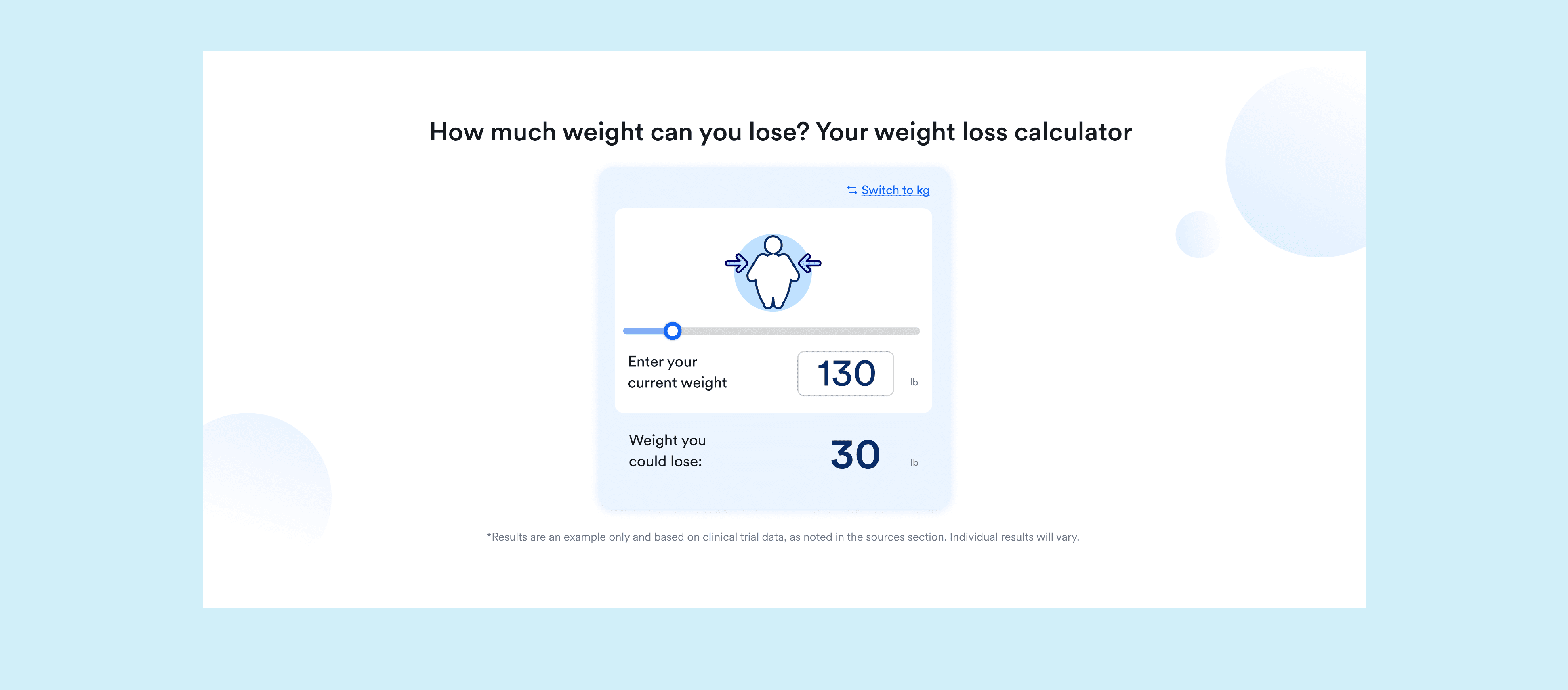
Weightloss
Weightloss
Asthma
Asthma
Allergy
Allergy
Cold sore
Cold sore
STD
STD
OCD
OCD
Sinus infection
Sinus infection
Fibromyalgia
Fibromyalgia
Back pain
Back pain
Yeast infection
Yeast infection
Lupus
Lupus
Diabetes
Diabetes
Nutrition
Nutrition
Headache
Headache
UTI
UTI
Heart problems
Heart problems
Pneumonia
Pneumonia
Migraine
Migraine
Irritable Bowel Syndrome
Irritable Bowel Syndrome
3. User flow
3. User flow
3. User flow
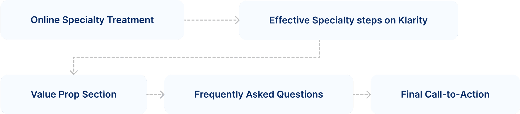
In the design of each specialty page, I closely adhered to the structured flow outlined in our layout diagram. Central to this design is the 'effective specialty steps on Klarity' – a pivotal section highlighted by strategic calls-to-action at both its commencement and conclusion. My approach centered on accentuating this middle step, recognizing its importance in guiding the user journey.
In the design of each specialty page, I closely adhered to the structured flow outlined in our layout diagram. Central to this design is the 'effective specialty steps on Klarity' – a pivotal section highlighted by strategic calls-to-action at both its commencement and conclusion. My approach centered on accentuating this middle step, recognizing its importance in guiding the user journey.
In the design of each specialty page, I closely adhered to the structured flow outlined in our layout diagram. Central to this design is the 'effective specialty steps on Klarity' – a pivotal section highlighted by strategic calls-to-action at both its commencement and conclusion. My approach centered on accentuating this middle step, recognizing its importance in guiding the user journey.
Because the "Effective Specialty steps on Klarity" part is the most important in this page, I emphasized this by making it the most visually dominant feature on the page.
Because the "Effective Specialty steps on Klarity" part is the most important in this page, I emphasized this by making it the most visually dominant feature on the page.
Because the "Effective Specialty steps on Klarity" part is the most important in this page, I emphasized this by making it the most visually dominant feature on the page.
Design
Design
Design
1. Design Exploration
1. Design Exploration
1. Design Exploration
In designing the website, I focused on user ease across all 20 specialties by applying a unified design theme to ensure consistent and intuitive navigation. I developed four different design explorations, each aimed at enhancing user engagement and ease of use, with extra effort dedicated to refining the most user-friendly and visually appealing option.
In designing the website, I focused on user ease across all 20 specialties by applying a unified design theme to ensure consistent and intuitive navigation. I developed four different design explorations, each aimed at enhancing user engagement and ease of use, with extra effort dedicated to refining the most user-friendly and visually appealing option.
In designing the website, I focused on user ease across all 20 specialties by applying a unified design theme to ensure consistent and intuitive navigation. I developed four different design explorations, each aimed at enhancing user engagement and ease of use, with extra effort dedicated to refining the most user-friendly and visually appealing option.

Final Design
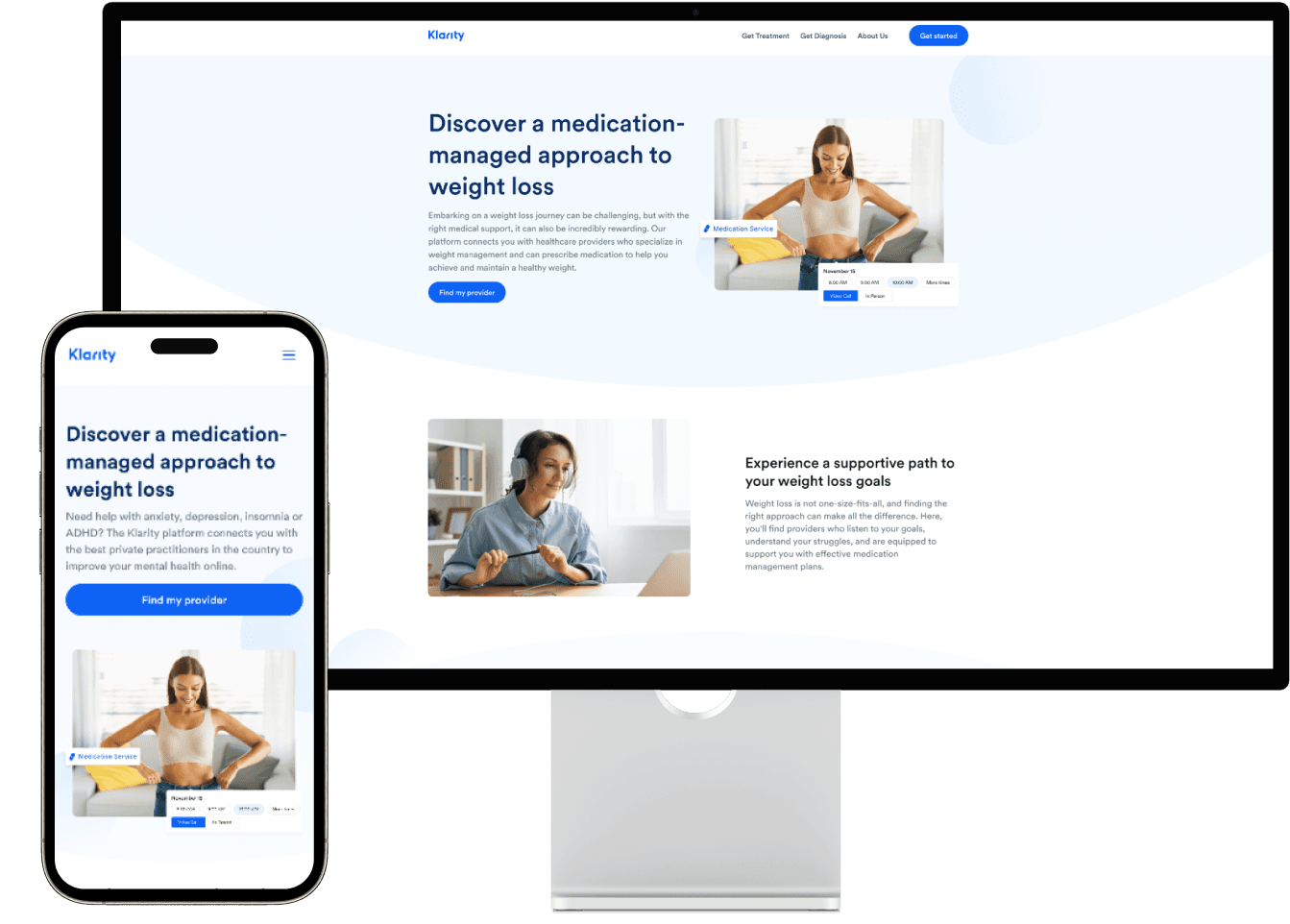
In our final decision, I opted for the rightmost design as exploration, as it struck the ideal balance in terms of visual appeal and functionality. This design avoids an overly white, stark appearance by incorporating a balanced left and right layout, offering flexibility in content presentation. The central alignment, flanked by white space on both sides, not only creates a visually pleasing aesthetic but also ensures screen adaptability across various devices.
In our final decision, I opted for the rightmost design as exploration, as it struck the ideal balance in terms of visual appeal and functionality. This design avoids an overly white, stark appearance by incorporating a balanced left and right layout, offering flexibility in content presentation. The central alignment, flanked by white space on both sides, not only creates a visually pleasing aesthetic but also ensures screen adaptability across various devices.
In our final decision, I opted for the rightmost design as exploration, as it struck the ideal balance in terms of visual appeal and functionality. This design avoids an overly white, stark appearance by incorporating a balanced left and right layout, offering flexibility in content presentation. The central alignment, flanked by white space on both sides, not only creates a visually pleasing aesthetic but also ensures screen adaptability across various devices.

Content on the screen is organized with clear spacing, improving clarity and distinction between modules, aiding in quick understanding and user engagement.
Content on the screen is organized with clear spacing, improving clarity and distinction between modules, aiding in quick understanding and user engagement.
Content on the screen is organized with clear spacing, improving clarity and distinction between modules, aiding in quick understanding and user engagement.
After finalizing the desktop layout, responsive design principles were used to create a specialized layout for mobile devices, ensuring a consistent and optimized user experience across all devices by adapting to the different requirements of smaller screens.
After finalizing the desktop layout, responsive design principles were used to create a specialized layout for mobile devices, ensuring a consistent and optimized user experience across all devices by adapting to the different requirements of smaller screens.
After finalizing the desktop layout, responsive design principles were used to create a specialized layout for mobile devices, ensuring a consistent and optimized user experience across all devices by adapting to the different requirements of smaller screens.
Design Showing
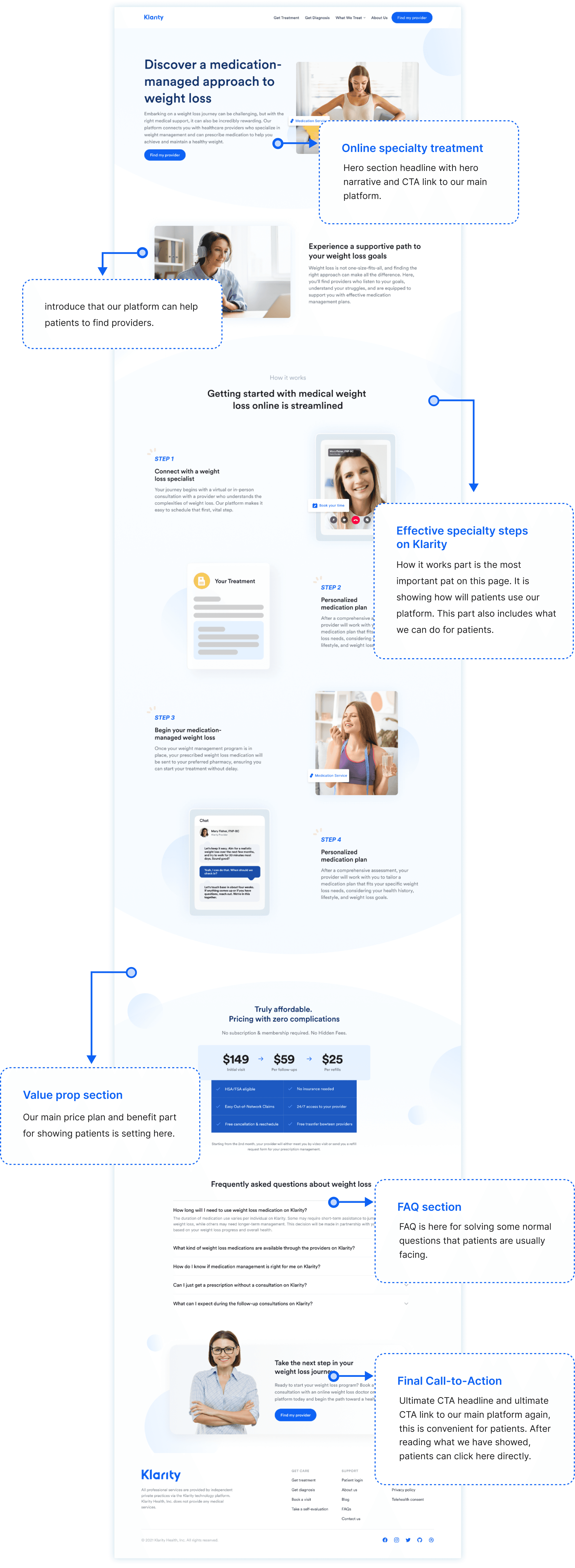
Image design
Final step of our design is designing different images on different pages according to the text of different parts. I designed 20 pages images and submitted them to the marketing team to upload.
Final step of our design is designing different images on different pages according to the text of different parts. I designed 20 pages images and submitted them to the marketing team to upload.


Final takeaways
Final takeaways
Final takeaways
Working within a stringent deadline posed a significant challenge in this project, particularly in managing time effectively. My collaboration with the staff Designer and Engineer was centered around prioritizing essential features and overcoming technical limitations of the templates, always with the user experience in mind. For the upcoming release, my goal is to incorporate more user feedback to further refine and enhance the pages, ensuring they not only meet but exceed user expectations for functionality and ease of use.
Working within a stringent deadline posed a significant challenge in this project, particularly in managing time effectively. My collaboration with the staff Designer and Engineer was centered around prioritizing essential features and overcoming technical limitations of the templates, always with the user experience in mind. For the upcoming release, my goal is to incorporate more user feedback to further refine and enhance the pages, ensuring they not only meet but exceed user expectations for functionality and ease of use.
Working within a stringent deadline posed a significant challenge in this project, particularly in managing time effectively. My collaboration with the staff Designer and Engineer was centered around prioritizing essential features and overcoming technical limitations of the templates, always with the user experience in mind. For the upcoming release, my goal is to incorporate more user feedback to further refine and enhance the pages, ensuring they not only meet but exceed user expectations for functionality and ease of use.