#webapp

#B2B

#Figma

Service and Price System - Kiwi Health

Service and Price System - Kiwi Health

Service and Price System - Kiwi Health

Service and Price System - Kiwi Health

Service and Price System - Kiwi Health

Service and Price System - Kiwi Health

Enhancing the B2B "Service and Price" platform's visual experience for health providers for Kiwi Health.

Enhancing the B2B "Service and Price" platform's visual experience for health providers for Kiwi Health.

Enhancing the B2B "Service and Price" platform's visual experience for health providers for Kiwi Health.

Enhancing the B2B "Service and Price" platform's visual experience for health providers for Kiwi Health.

Enhancing the B2B "Service and Price" platform's visual experience for health providers for Kiwi Health.

Enhancing the B2B "Service and Price" platform's visual experience for health providers for Kiwi Health.

2024 - present

Timeline

UI/UX Designer

Role

2024 - present

Timeline

UI/UX Designer

Role

Background

Background

The onboarding process was designed for Kiwi Health’s service and pricing flow. This project was led by our staff product designer, Catherine (Yizhi) Zhang, with whom I collaborated as the UI/UX designer. The project focuses on enabling health providers to have a better and more convenient experience using the Kiwi Health web app through this design.

The onboarding process was designed for Kiwi Health’s service and pricing flow. This project was led by our staff product designer, Catherine (Yizhi) Zhang, with whom I collaborated as the UI/UX designer. The project focuses on enabling health providers to have a better and more convenient experience using the Kiwi Health web app through this design.

Problem

Problem

“How to use design method or design thinking to give providers a better experience.”

“How to use design method or design thinking to give providers a better experience.”

Goals

Goals

1

Bringing a new dimension to user experiences and interfaces.

The visual design is built to improve the experience and help providers make quick and easy judgments about every part of the Kiwi Health web app as they use it.

1

Bringing a new dimension to user experiences and interfaces.

The visual design is built to improve the experience and help providers make quick and easy judgments about every part of the Kiwi Health web app as they use it.

1

Bringing a new dimension to user experiences and interfaces.

The visual design is built to improve the experience and help providers make quick and easy judgments about every part of the Kiwi Health web app as they use it.

2

Finish a rush project

Because we received this project on short notice, I participated by helping improve the UIUX design based on my lead’s initial draft and refining the details of the existing design.

2

Finish a rush project

Because we received this project on short notice, I participated by helping improve the UIUX design based on my lead’s initial draft and refining the details of the existing design.

2

Finish a rush project

Because we received this project on short notice, I participated by helping improve the UIUX design based on my lead’s initial draft and refining the details of the existing design.

Tools

Tools

Figma

Discover key pain points

Discover key pain points

Discover key pain points

1: Headline page

Given the extensive content provided by our product manager, I decided to use a combination of words and images to convey the information on this page of our web app.

2: Service selection page

For each part, because our new copy is too long, we need to redesign the cards and create icons for each card.


Additionally, practice states cannot be re-added if you delete the states selected based on the provider's license.

3: Form filling

Some parts of the form are not clearly understandable. The pricing section needs to be redesigned based on user habits.


At the same time, the pricing section does not clearly indicate whether the price is high or low compared to other providers.

4: Form section

The different sections are not well-separated, making it difficult for health providers to identify which part they are filling out.

Solution

Solution

Solution

1. Introduction page

I designed this page based on the word documents, integrating the text with some images and icons.

I designed this page based on the word documents, integrating the text with some images and icons.

I designed this page based on the word documents, integrating the text with some images and icons.

2. Selection Cards

I redesigned the cards for the selection page. My lead added some new functions this time, and I need to consider how to incorporate them into the cards.

I redesigned the cards for the selection page. My lead added some new functions this time, and I need to consider how to incorporate them into the cards.

I redesigned the cards for the selection page. My lead added some new functions this time, and I need to consider how to incorporate them into the cards.

  1. Price Setting Page

We added more sections to the page. First, we redesigned the 'Application States' section, including a display of the provider's selected states to give them an overview of the areas they serve. We also added a 'Name and Description' section for providers to set up what they want to display to their patients.


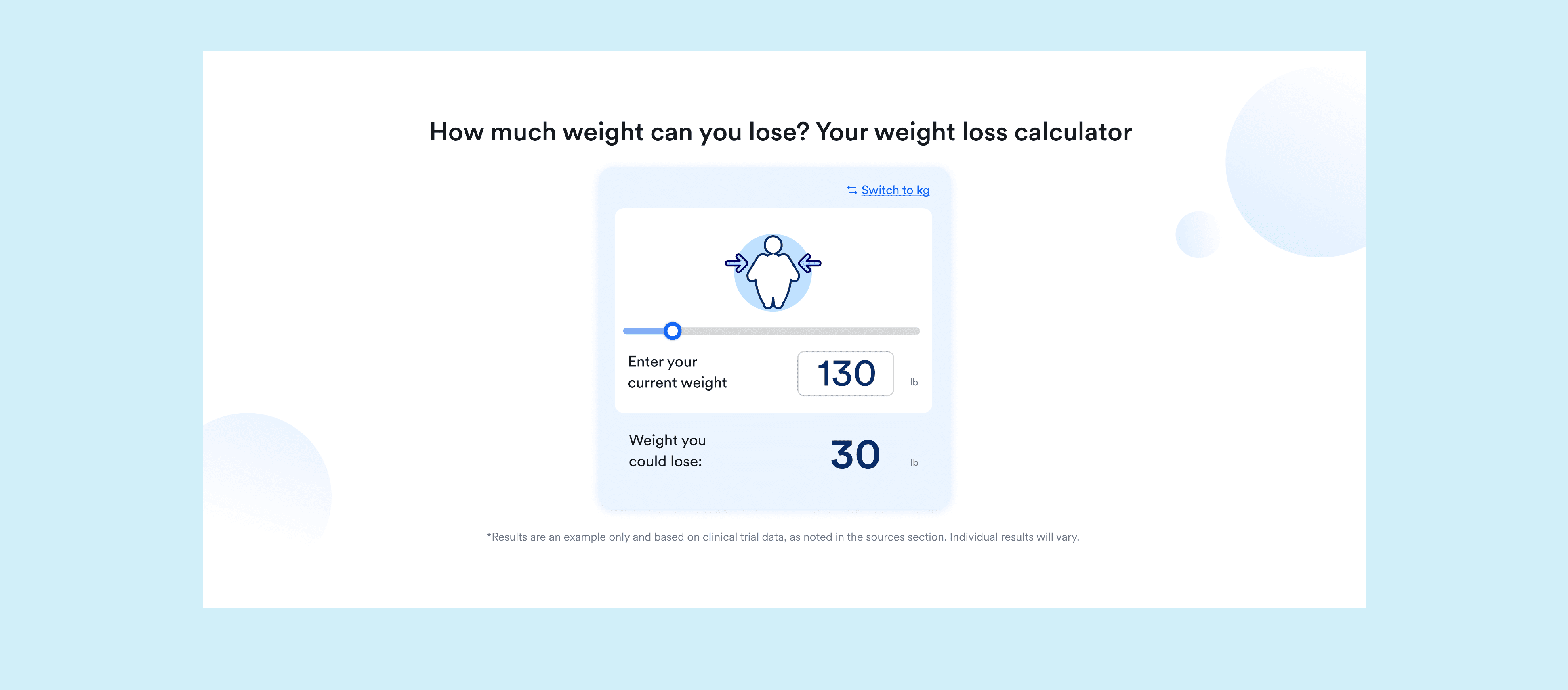
For 'Price and Duration,' our previous design did not clearly show whether a high or low price was appealing to patients. Inspired by the price range display for booking airplane tickets, we used intuitive colors and emojis to convey price insights.


Additionally, we made changes and redesigns to the 'Contact Type' and 'Patient Groups and Limitations' sections.

4. The whole price setting page

For the design of the entire page, I switched from the original line-divided format to a color-blocked layout. This change makes the sections look more like distinct boards, enhancing their visual separation.

For the design of the entire page, I switched from the original line-divided format to a color-blocked layout. This change makes the sections look more like distinct boards, enhancing their visual separation.

For the design of the entire page, I switched from the original line-divided format to a color-blocked layout. This change makes the sections look more like distinct boards, enhancing their visual separation.

A Successful Release

A Successful Release

A Successful Release

The visual design of the entire UI makes the originally cluttered page look more organized, displaying key information more intuitively. Providers can find what they need quickly and easily, saving their reading time.

The visual design of the entire UI makes the originally cluttered page look more organized, displaying key information more intuitively. Providers can find what they need quickly and easily, saving their reading time.

"Throughout the visual design of the project, our information was displayed more effectively, which was also very useful for content management on our price-setting pages!"

"Throughout the visual design of the project, our information was displayed more effectively, which was also very useful for content management on our price-setting pages!"

"Throughout the visual design of the project, our information was displayed more effectively, which was also very useful for content management on our price-setting pages!"

"Throughout the visual design of the project, our information was displayed more effectively, which was also very useful for content management on our price-setting pages!"

"Throughout the visual design of the project, our information was displayed more effectively, which was also very useful for content management on our price-setting pages!"

——— Operation Team Leader

——— Operation Team Leader

——— Operation Team Leader

"The visual presentation of the entire process was designed to make the layout of information on our products simpler and clearer."

"The visual presentation of the entire process was designed to make the layout of information on our products simpler and clearer."

"The visual presentation of the entire process was designed to make the layout of information on our products simpler and clearer."

"The visual presentation of the entire process was designed to make the layout of information on our products simpler and clearer."

"The visual presentation of the entire process was designed to make the layout of information on our products simpler and clearer."

——— Product manager

——— Product manager

The improved visual design of the process aims to increase the efficiency and productivity of providers, saving time and simplifying tasks. I am eagerly looking forward to the next phase of development for the entire price-setting process and am confident it will continue to evolve to better meet the needs of our product's providers.

The improved visual design of the process aims to increase the efficiency and productivity of providers, saving time and simplifying tasks. I am eagerly looking forward to the next phase of development for the entire price-setting process and am confident it will continue to evolve to better meet the needs of our product's providers.

The improved visual design of the process aims to increase the efficiency and productivity of providers, saving time and simplifying tasks. I am eagerly looking forward to the next phase of development for the entire price-setting process and am confident it will continue to evolve to better meet the needs of our product's providers.

The improved visual design of the process aims to increase the efficiency and productivity of providers, saving time and simplifying tasks. I am eagerly looking forward to the next phase of development for the entire price-setting process and am confident it will continue to evolve to better meet the needs of our product's providers.

The improved visual design of the process aims to increase the efficiency and productivity of providers, saving time and simplifying tasks. I am eagerly looking forward to the next phase of development for the entire price-setting process and am confident it will continue to evolve to better meet the needs of our product's providers.

The improved visual design of the process aims to increase the efficiency and productivity of providers, saving time and simplifying tasks. I am eagerly looking forward to the next phase of development for the entire price-setting process and am confident it will continue to evolve to better meet the needs of our product's providers.

Takeaways

Takeaways

Takeaways

This is the first time I've encountered such a complex UI/UX design for a B2B product. Because our product is relatively new, I was not able to find many intuitive design references. It took a lot of time to find suitable references and apply them to our product pages. I am very thankful to my lead and other designers for their suggestions throughout the design process. This project was a great opportunity for me to quickly learn how to make the design of a B2B product more effective. What I learned from this experience is my biggest gain.

This is the first time I've encountered such a complex UI/UX design for a B2B product. Because our product is relatively new, I was not able to find many intuitive design references. It took a lot of time to find suitable references and apply them to our product pages. I am very thankful to my lead and other designers for their suggestions throughout the design process. This project was a great opportunity for me to quickly learn how to make the design of a B2B product more effective. What I learned from this experience is my biggest gain.

Made by Jingwen Zhang

jingwencatzhang@gmail.com

Made by Jingwen Zhang

jingwencatzhang@gmail.com

Made by Jingwen Zhang

jingwencatzhang@gmail.com

Made by Jingwen Zhang

jingwencatzhang@gmail.com