#motion
#web
#Figma
#UI design

Bringing a new dimension to the interfaces.
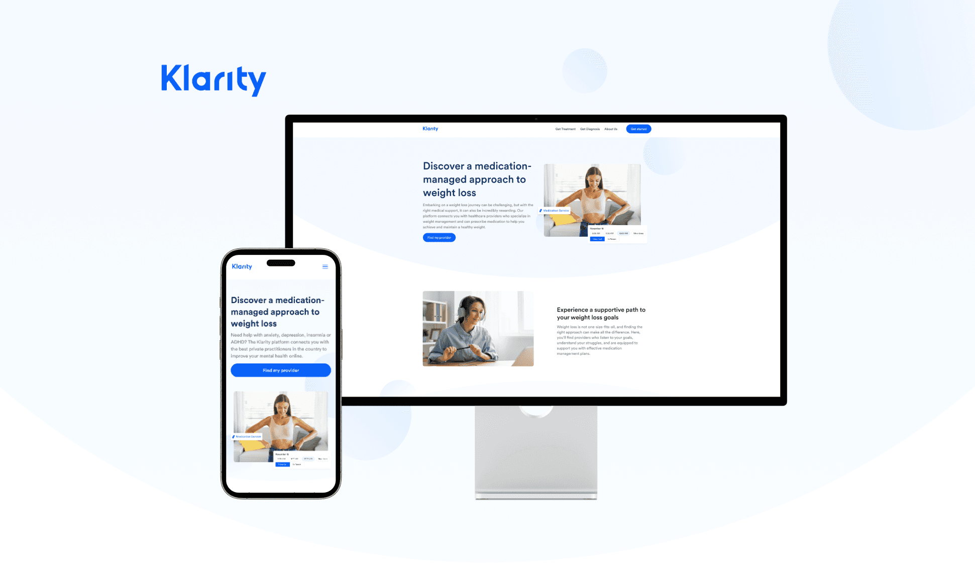
After a meeting, we decided to create a weight loss calculator for patients to use to check how much weight they need to lose. This visual component aims to draw more patients' attention to our weight loss page and related medication services, encouraging them to continue browsing the Klarity page for a suitable provider.
Figma
What we found
We found a reference from a website, which features a simple design for a weight loss calculator.


This is another design reference for a weight loss calculator.
Solution
Synthesizing the references we found, we began designing our own weight loss calculator. We opted for a simpler design and added associated icons to increase visual interest. With the icons in place, we decided to incorporate a dynamic body change effect to visually show the weight change.
Exploration

This design is quite basic. The current weight is displayed at the top of the scroll bar, and the 'weight to lose' part is shown below the bar. However, a drawback of this design is that the human body dynamics are not obvious, making them difficult to notice, especially in the corners.
In this design, I separated the two sections with two color blocks each, leaving the icon section, where we will place the animation, as the main display. However, the disadvantage of this design is that the overall layout appears too scattered. We also added toggle buttons for kg and lbs to accommodate patients' preferences and included an input section for patients to type in their weight.


The scroll bar is placed at the top of the design. However, the disadvantage is that it's not very clear which number the user is controlling.
This design places the animation part in the center, but the curved scroll bar is too complicated. The overall layout is cluttered and not as intuitive as the previous design.

Final design
We ended up with a square design that combines the best elements of these previous designs.


In this design, I separated the 'enter your current weight' section with a white color block to distinguish it from the 'weight you could lose' section. I placed the animation part above the scroll bar, in the center, to make it more visible.
Dynamic effect display: As the scroll bar slides, the numbers change along with the size of the icon.
Customer retention:
The overall design has contributed to improved customer retention, with users more likely to continue browsing the site and utilizing other related services.
Increased user engagement:
After completing the design of our weight loss calculator, we observed a significant increase in user engagement metrics, including the amount of time users spent on the calculator and the return rate.
Takeaways
This was my first time integrating animation into UI/UX design. Although I tried many methods during the process, the final presentation turned out to be relatively perfect. This design also marked the first time I used After Effects in UI/UX design, which not only strengthened my skills with the software but also provided valuable experience in collaborating with engineers.
I understand the importance of maintaining communication with all stakeholders to ensure everyone is aligned on needs and desired outcomes. This is especially crucial when working closely with engineering and product teams.